How it started?
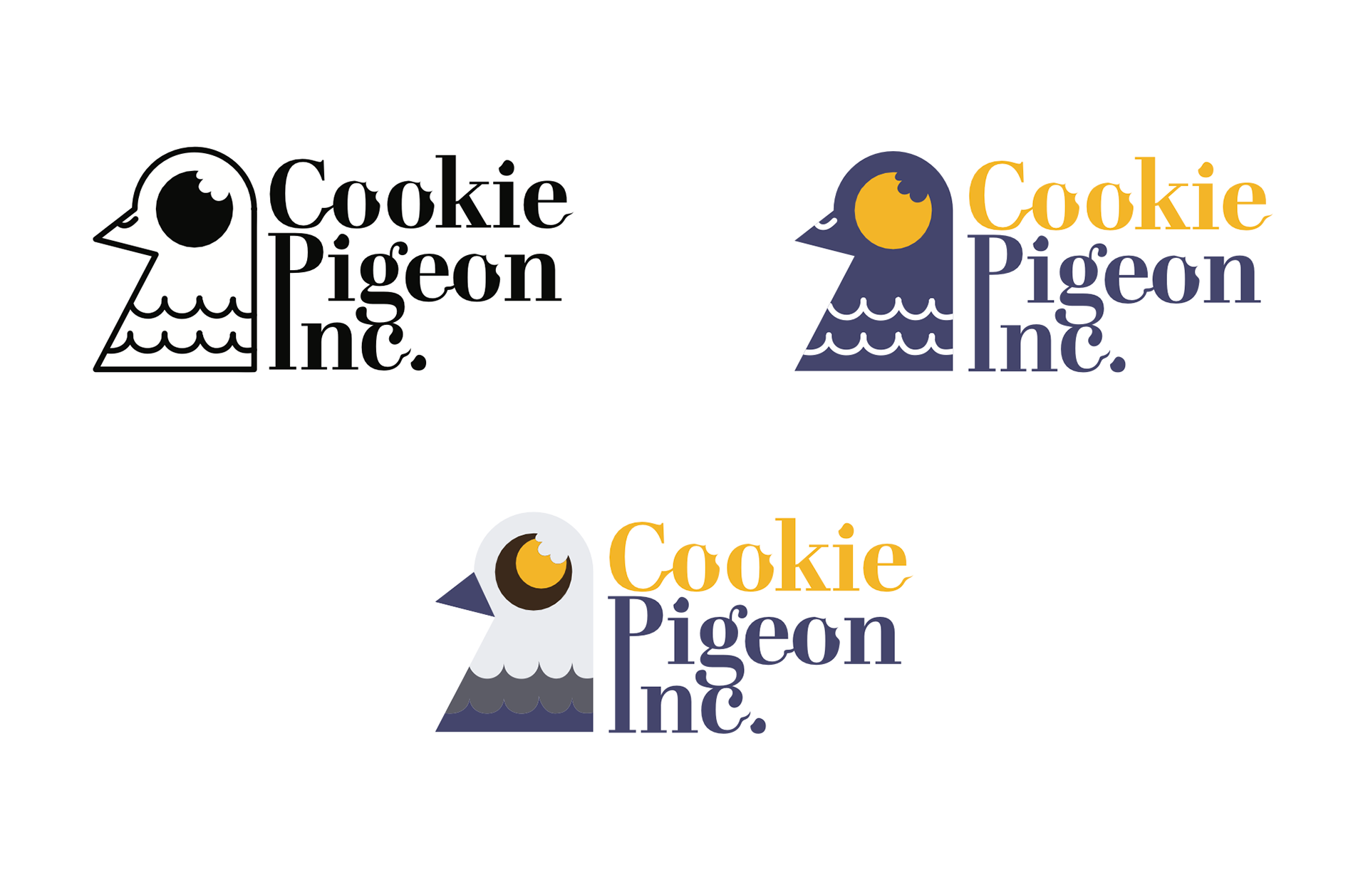
The goal was to create a logo for the Online cookie business located in New York. The local company was created during Covid as a means to get your favorite cookies delivered to you without the risk of going outside. In addition, the business aimed to create a feeling of the busy corporate life of a New Yorker, incorporating the funny idea of pigeons having their own company. The final product needed to work in two-, three-, and five-colors, stand out Online, and be printed cohesively on the apparel.
Considering the client’s needs, I wanted to create something memorable and straightforward. Due to the business’s focus on delivery, my designs needed to incorporate the idea of mail and pigeon. Delving deeper into color theory, vibrant yellow and inspirational blue seemed just right to represent the freshness of the up-and-coming business in NY.

Outcome:
The final product was an easily recognizable logo that incorporated pigeon and cookie forms into the design. The font mimicked corporate America to create a business-like feel successfully. Since the structures in the design were already complex, I chose simple colors: blue, yellow, dark gray, and light gray. Moreover, since the client wanted the logo to be specifically printed on the T-shirts, I provided the reference of how the design would look if printed.