How it started?
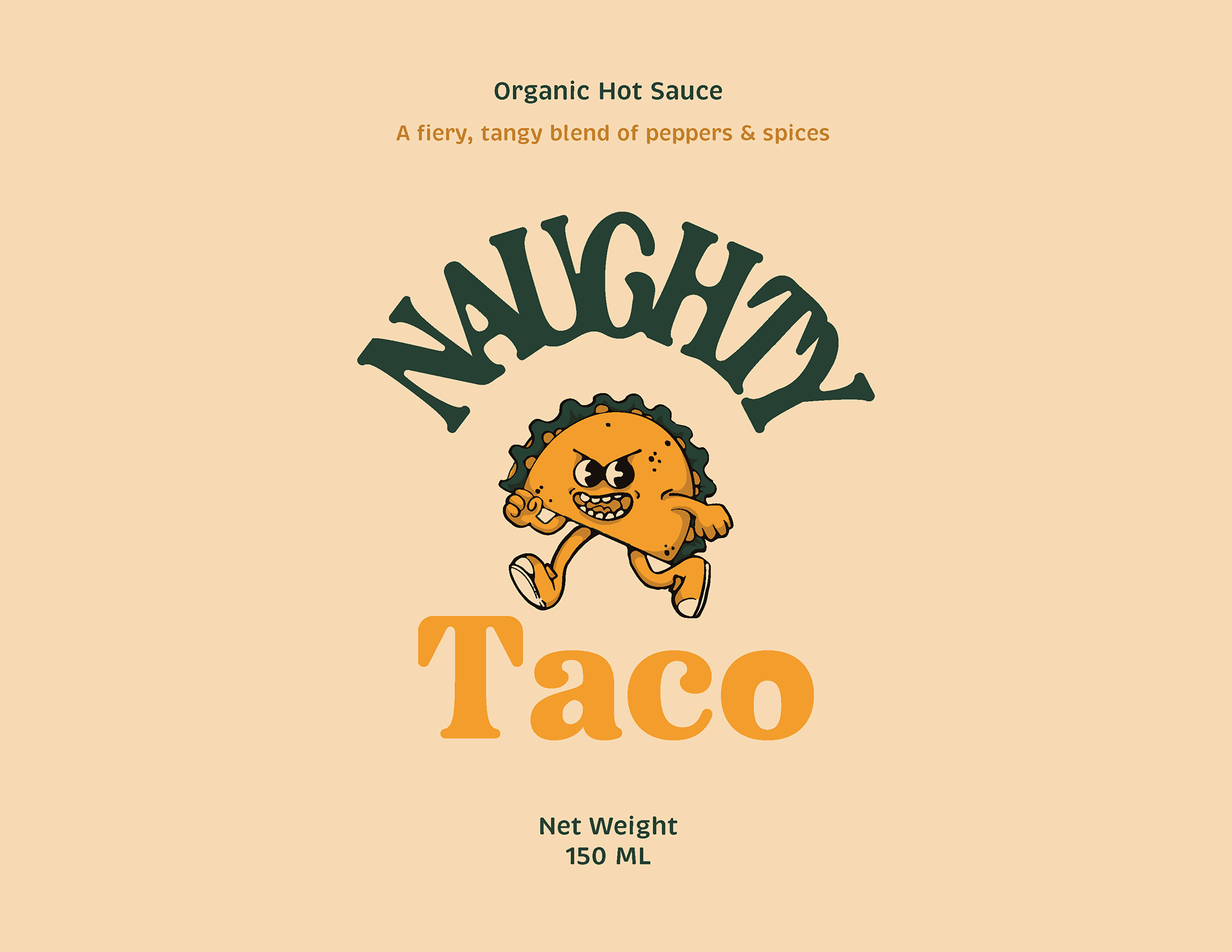
The prompt focused on creating an identity for a newly opened Mexican taco restaurant that wanted to launch its sauce. They wanted to incorporate a basic form of “taco” in their logo, to stand out from other competitors and be able to communicate with a community of various ages.
Challenge:
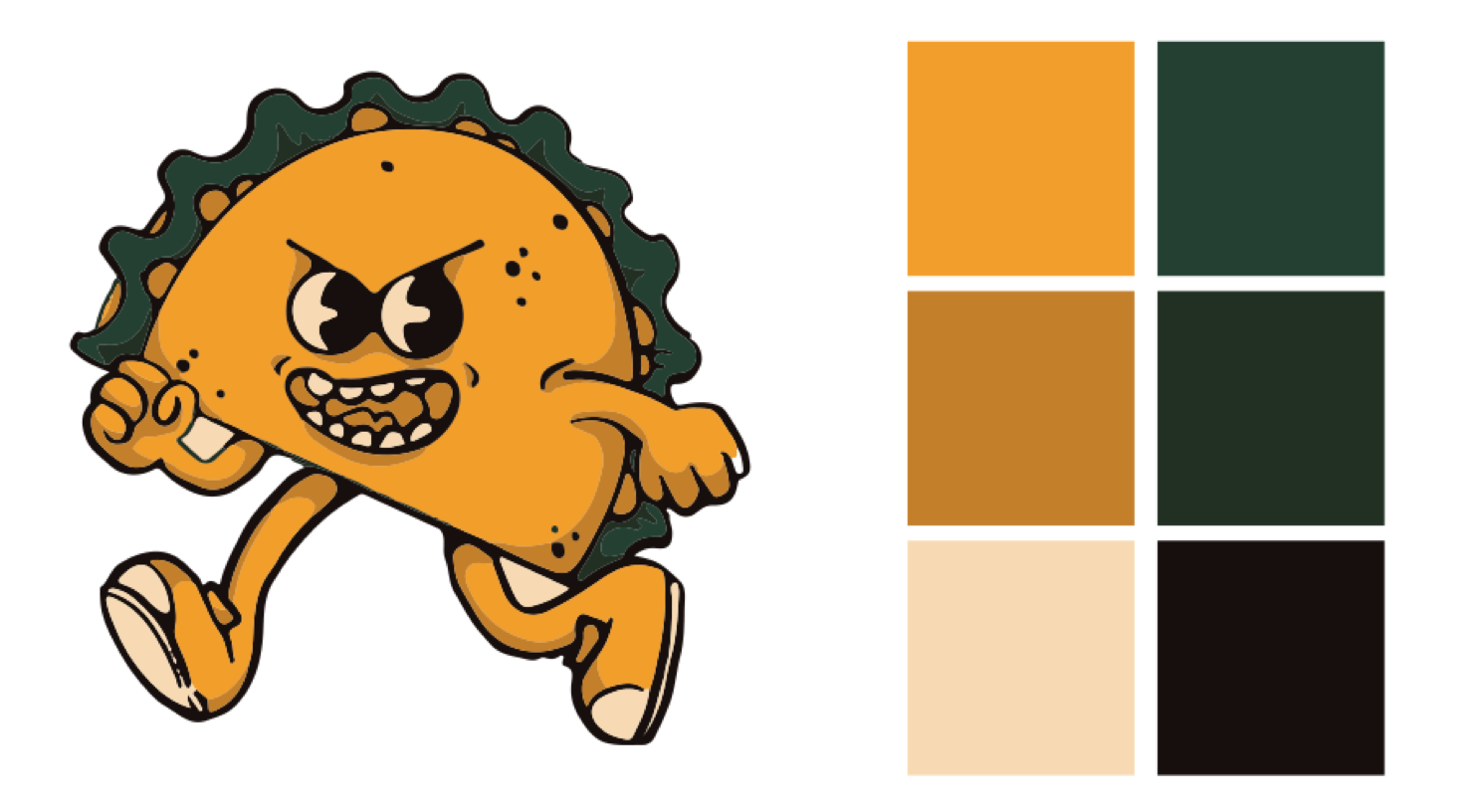
The challenge with this design was to create something that would stand out in the market filled with similar businesses. There were already other Taco restaurants, so the logo did not only need to be recognizable but also had to be differentiated from its competitors. Considering this, I chose to personalize the design elements, creating a brand character rather than just a soulless symbol. This idea allowed me to differentiate this restaurant from others and make it customer friendly regardless of age.
Outcome:
To balance the complexity of the design, I focused on using the tonality of two colors: yellow and green. The fun and energetic yellow brought in the liveliness of the new restaurant and looked well with the bright red sauce the restaurant planned to sell. The final design’s versatility allowed it to stand out on its own in Online media and be trendy and recognizable on the physical merch with no loss of quality or relevance.
