
Overview
Swanpond Art is a multidisciplinary creative practice by a Halifax-based fashion designer whose work is deeply influenced by Caribbean heritage and second-generation Canadian identity. Her garments, accessories, and mixed-media pieces celebrate cultural memory, vibrant color, and the expressive rhythm of music, festivals, and storytelling.
The goal of this project was to create a cohesive visual identity that could unify these diverse forms of expression while honoring cultural roots in a contemporary, refined way.
Problem & Goals
The fashion designer needed a brand system that could:
→ Connect fashion, accessories, and fine art under one recognizable identity
→ Reflect Caribbean cultural richness without feeling folkloric or dated
→ Balance warmth and vibrancy with a modern, professional tone
→ Adapt across digital platforms, printed materials, and fabric applications
Research & Insight
I explored Caribbean visual culture, textile traditions, and contemporary fashion branding to understand how heritage can be expressed without relying on cliché symbolism. A key insight emerged around duality of Caribbean vibrancy, rhythm, and color and Canadian clarity, restraint, and modern structure. This balance became the conceptual foundation for the identity system.
*Time and budget limitations required a focused, efficient design process while still delivering depth and meaning.
Visual Identity System
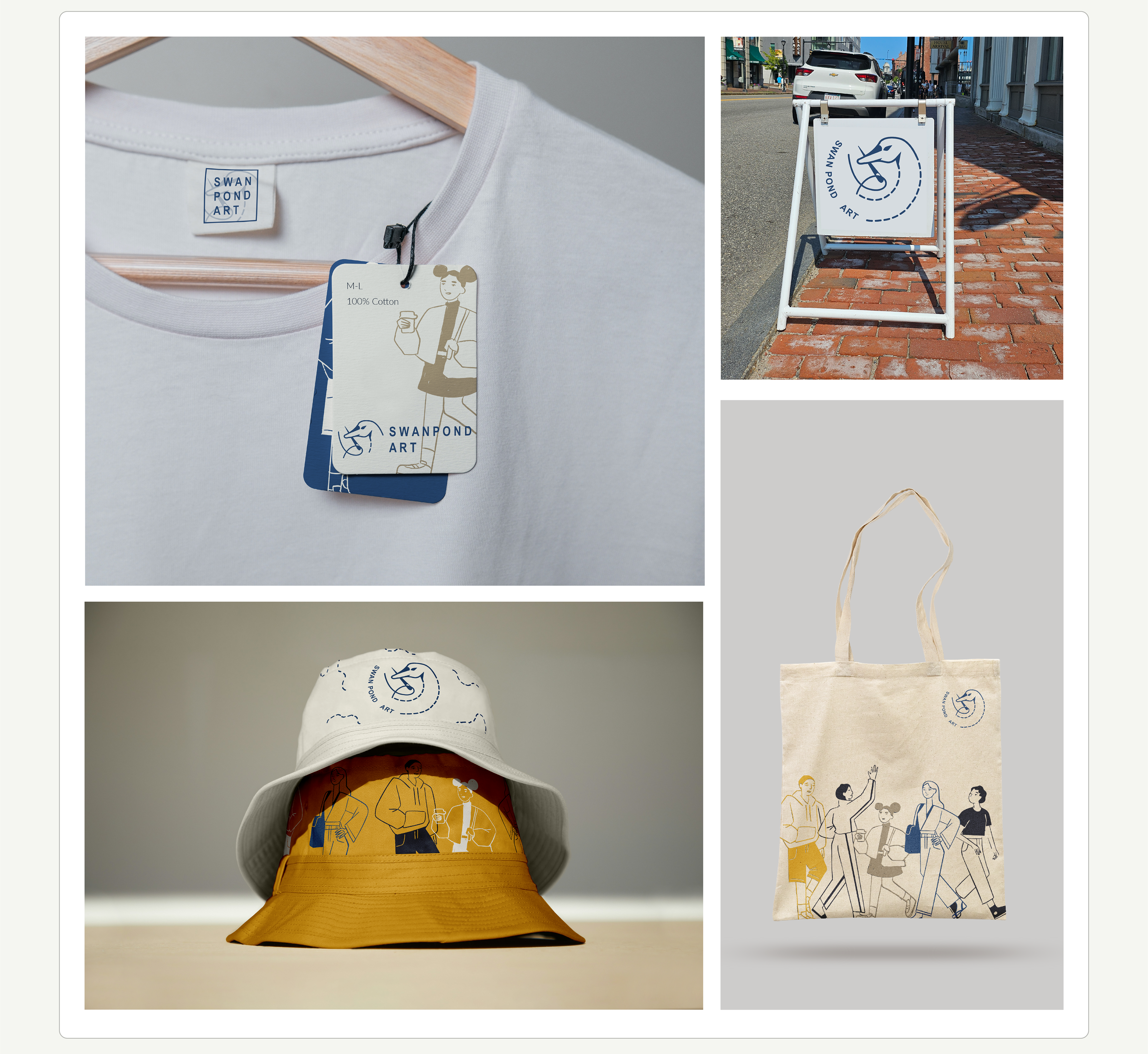
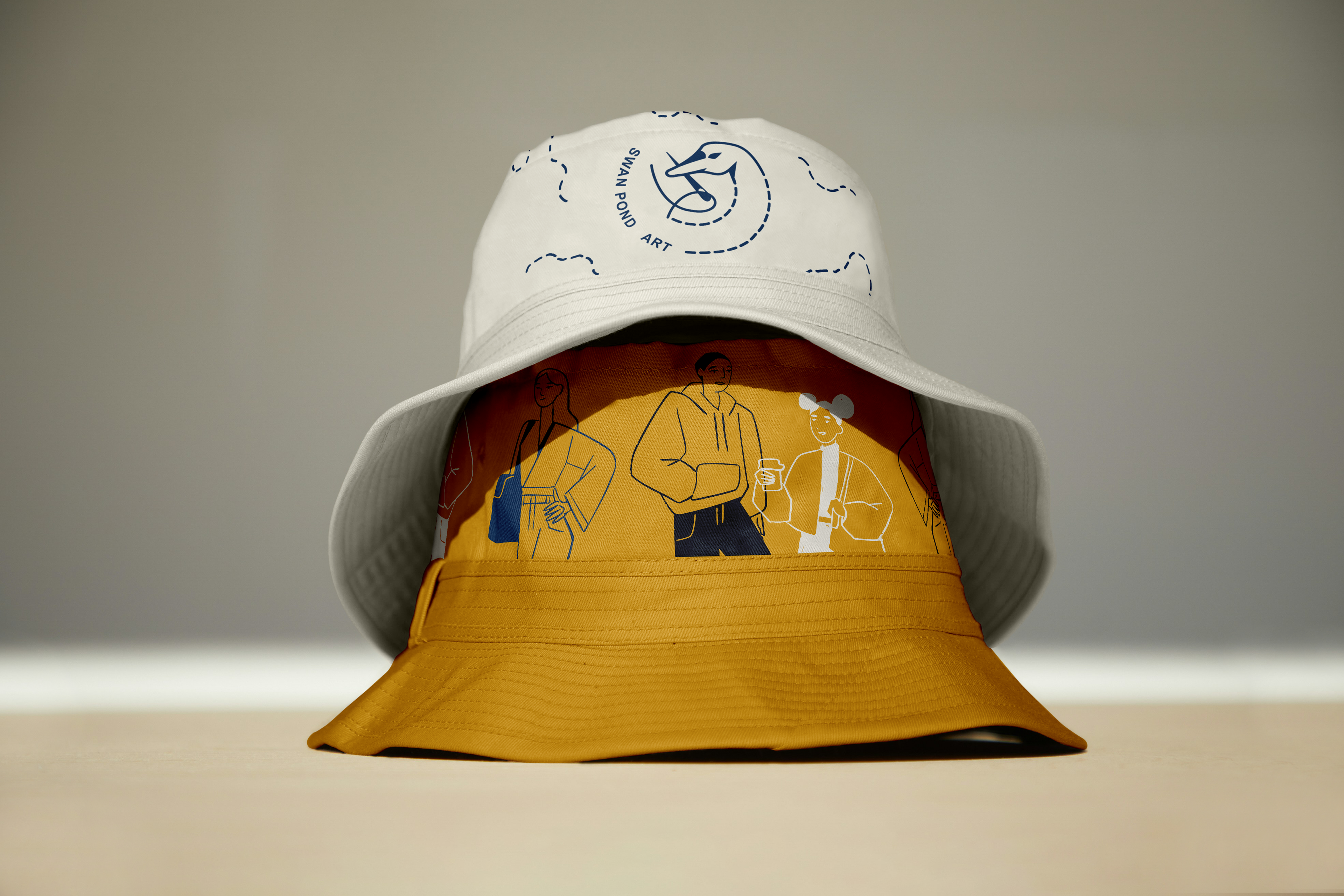
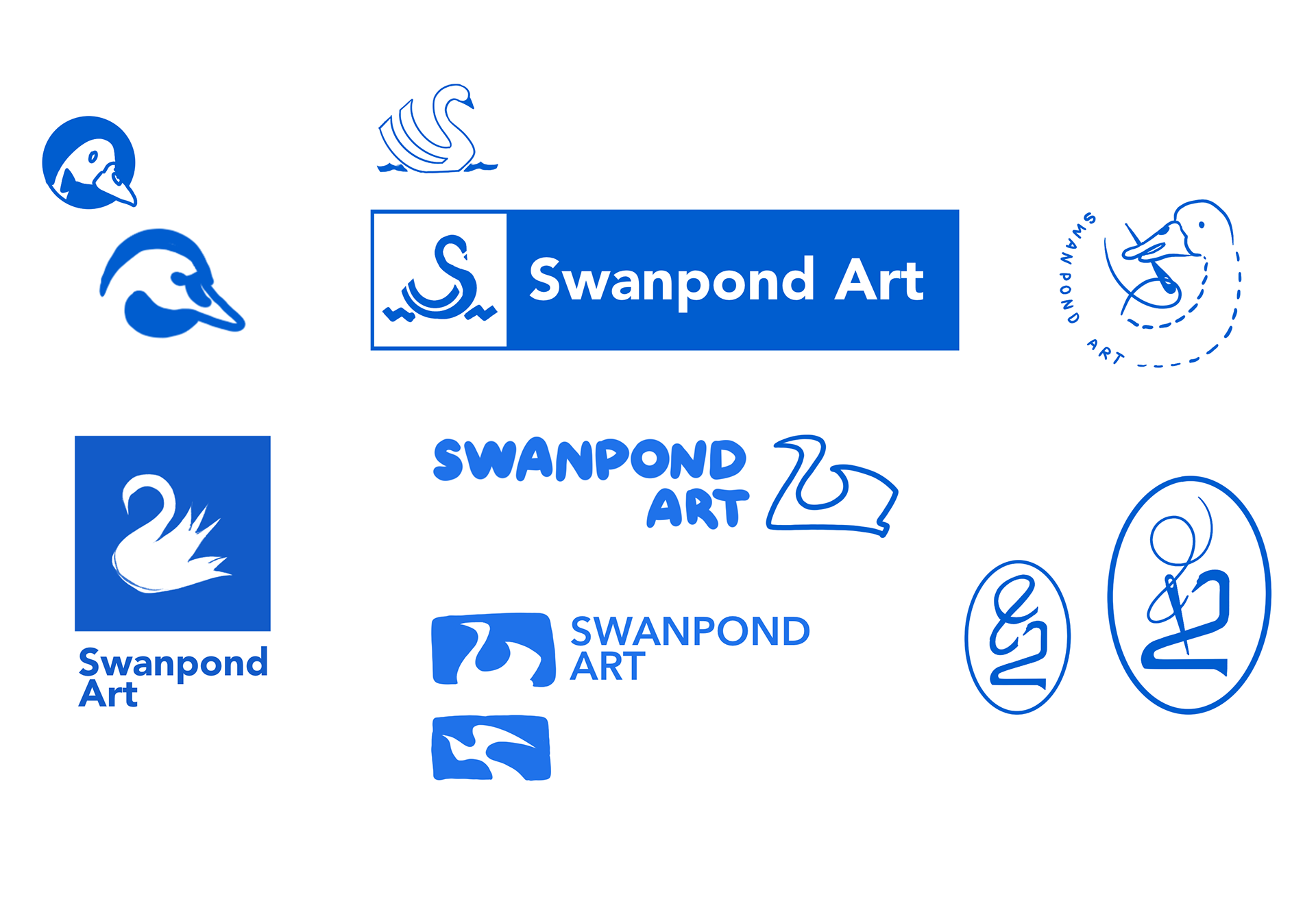
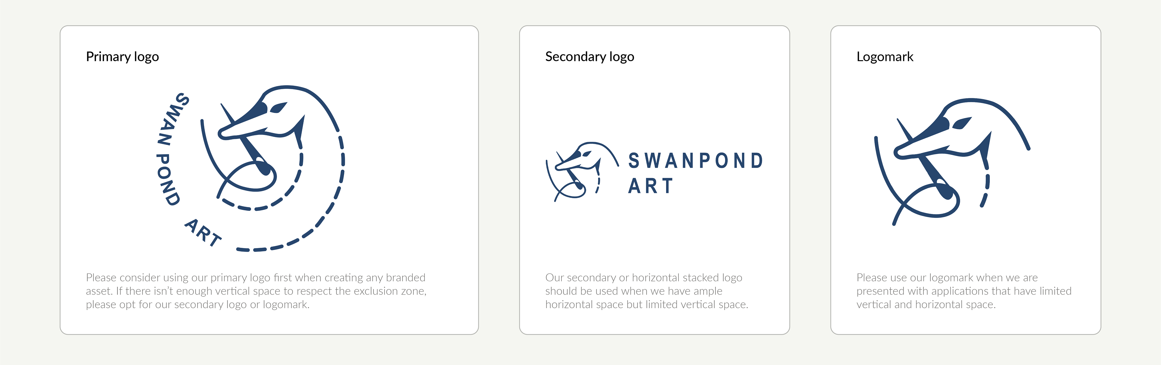
Logo Suite
I designed a flexible logo family consisting of a primary logo, secondary horizontal lockup, and compact logomark.
The swan motif evokes elegance, movement, and personal symbolism, while flowing linework subtly references sewing paths and creative motion, bridging fashion craft with artistic expression.
The swan motif evokes elegance, movement, and personal symbolism, while flowing linework subtly references sewing paths and creative motion, bridging fashion craft with artistic expression.
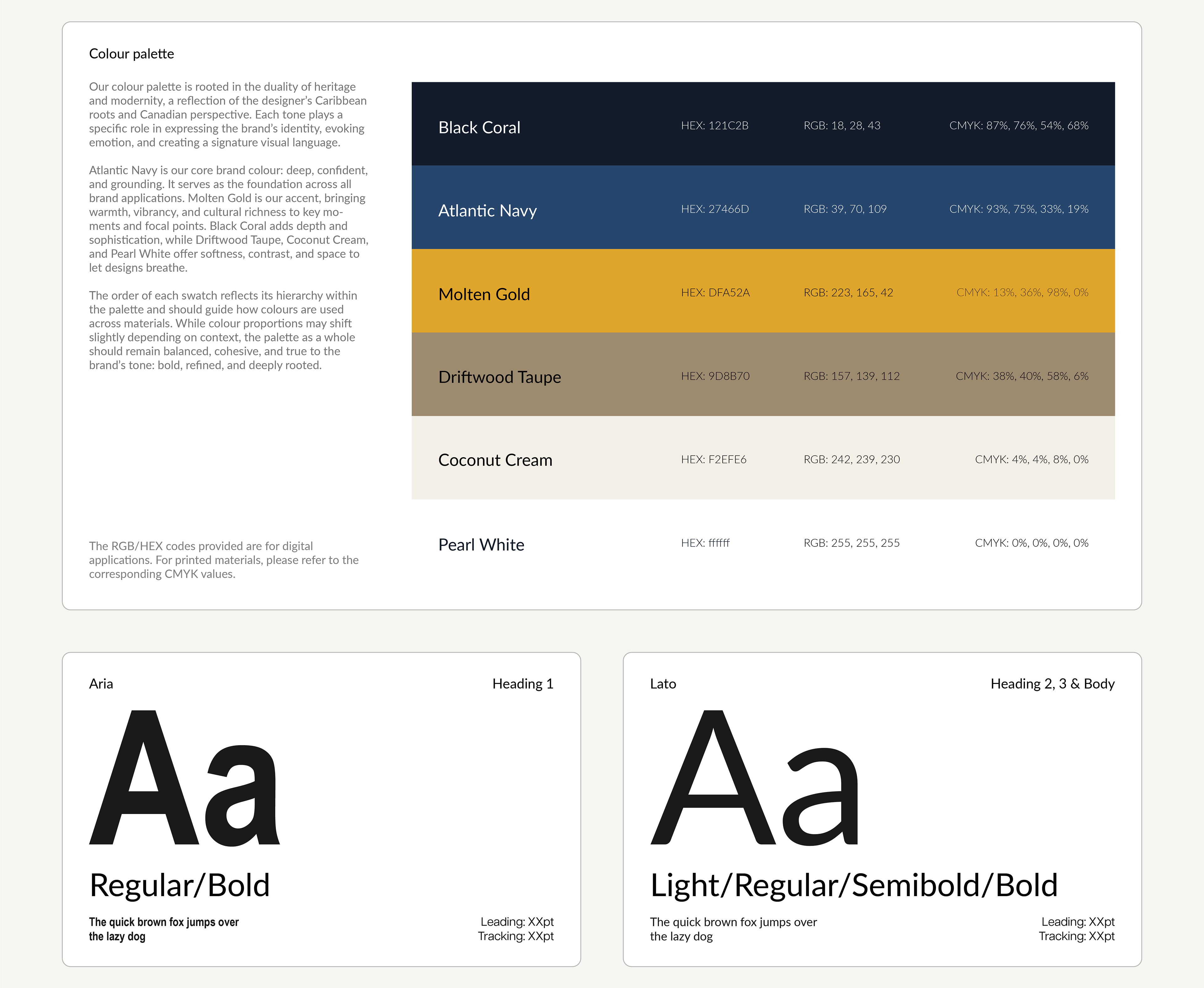
Color Palette
The palette is rooted in the duality of heritage and modernity, expressing emotion while maintaining cohesion:
→ Atlantic Navy: deep, confident, grounding foundation
→ Molten Gold: warmth, vibrancy, and cultural richness
→ Black Coral: depth and sophistication
→ Driftwood Taupe, Coconut Cream, & Pearl White: softness, contrast, and breathable space
Together, these tones create a bold yet refined visual language adaptable across mediums.
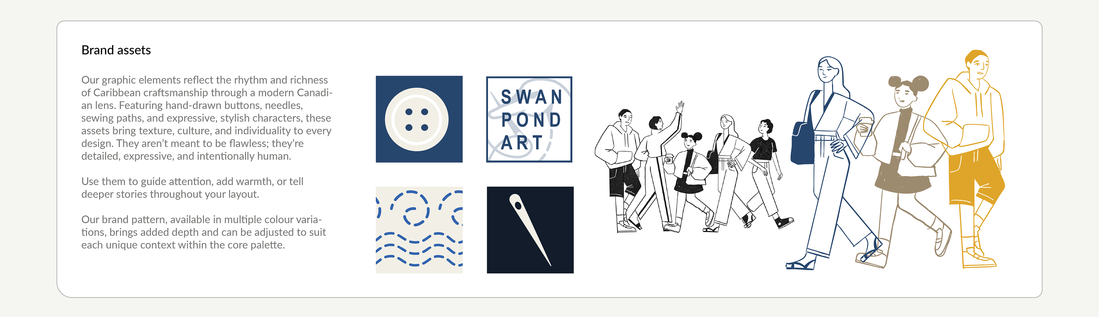
Graphic Elements
Custom illustrations including hand-drawn buttons, needles, stitching paths, and expressive characters capture the rhythm and humanity of Caribbean craftsmanship through a contemporary lens.
These elements are intentionally detailed and imperfect, adding warmth, storytelling, and texture across layouts.
A flexible brand system extends this language into print, digital, and fabric applications.
A flexible brand system extends this language into print, digital, and fabric applications.
Solution
The final identity delivers a cohesive, culturally grounded, and versatile brand system that supports Swanpond Art’s multidisciplinary practice.
It bridges heritage and modernity through:
→ Elegant, motion-driven logo design
→ A hierarchically structured, emotionally resonant palette
→ Expressive graphic assets adaptable across contexts
Despite limited time and resources, the system establishes a strong visual foundation for continued artistic and commercial growth.
Impact
→ Created a unified presence across fashion, accessories, and fine art
→ Enabled consistent branding for exhibitions, web, and printed materials
→ Provided a scalable identity system to support future collections and storytelling
The project positions Swanpond Art with clarity, confidence, and cultural authenticity.