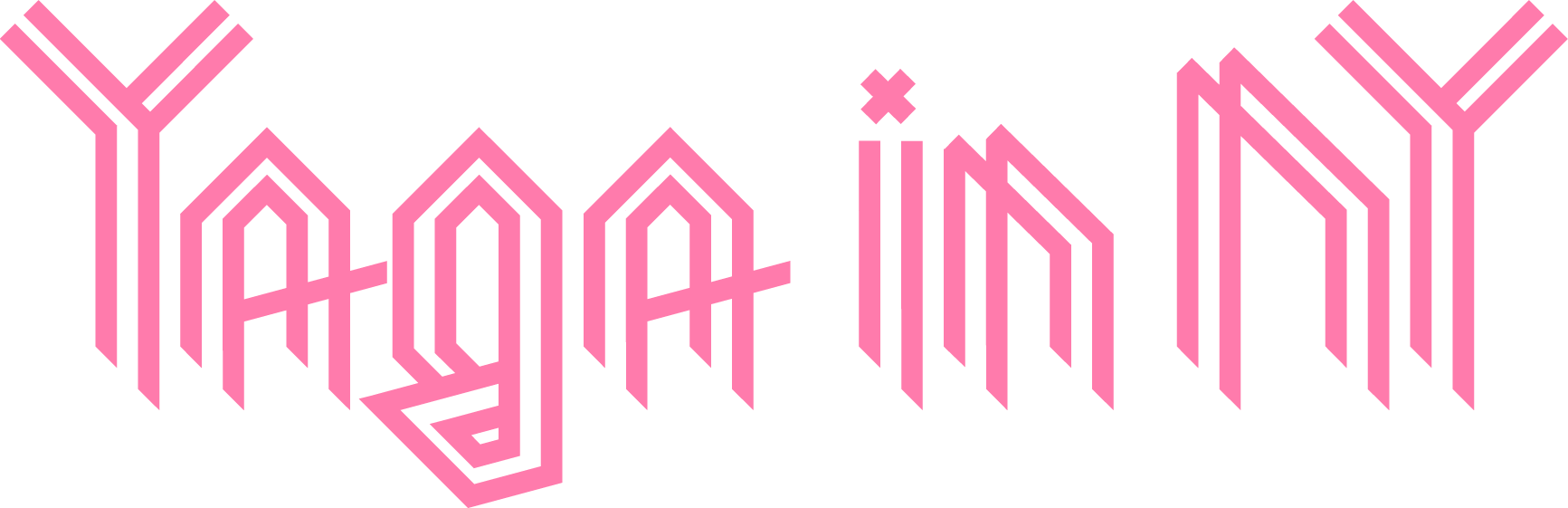
I designed a playful, easy-to-manage blog webpage and brand system for Yaga in NY.
Problem & Goals
The client wanted a blog they could manage with little effort, while readers needed a page that was easy to navigate and visually distinct.
Objectives:
→ Create a blog that is effortless for the client to maintain
→ Ensure the reading experience is clear, engaging, and cohesive
→ Build a small visual system that extends beyond the site and gives the client tools for ongoing customization
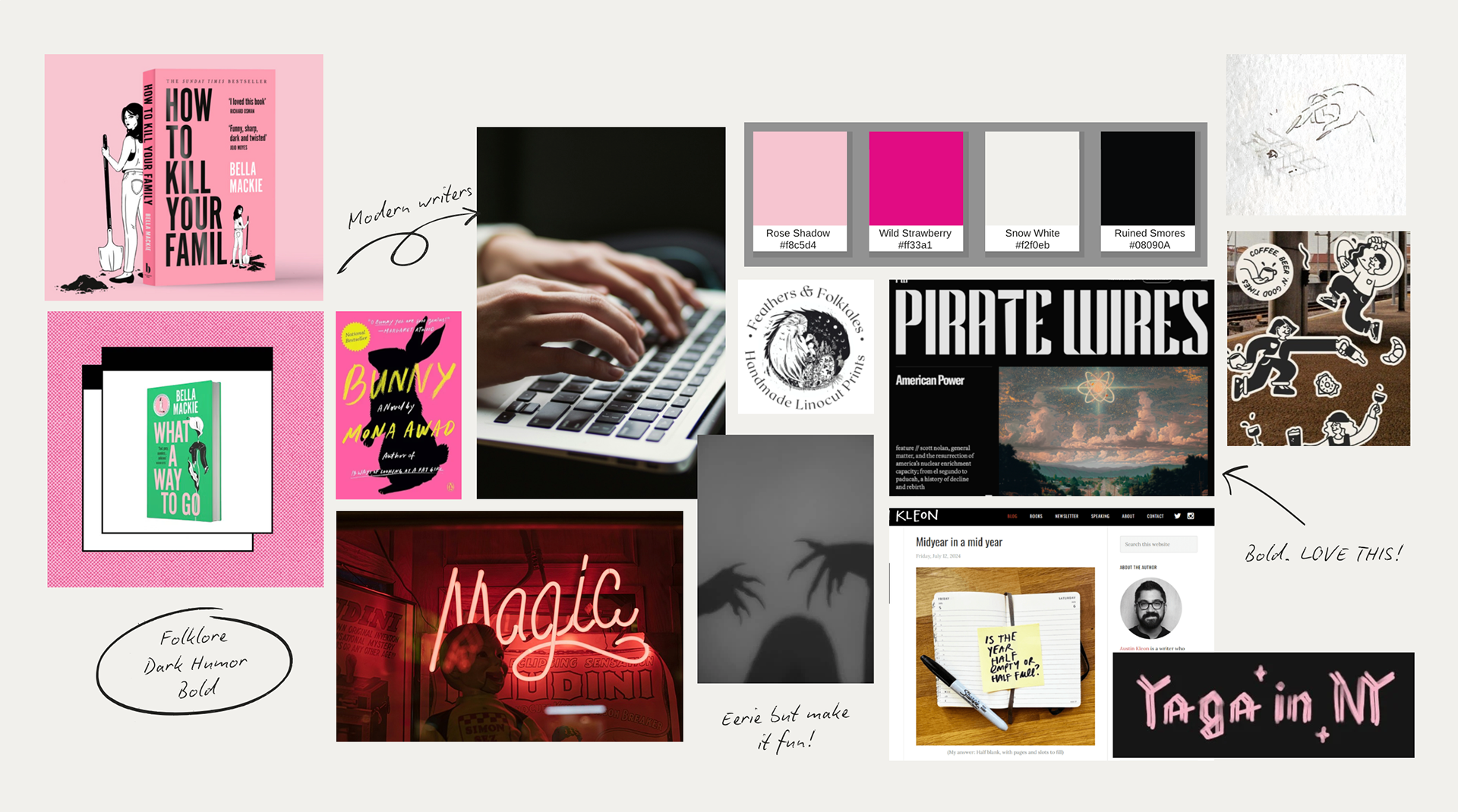
Research & Insight
I studied independent blogs to understand how they balance personality with usability. I identified common friction points for self-managed sites, such as readability on small screens and consistent post formatting.
Findings:
→ Users value readability
→ Admin needs easy maintenance
→ Strong visuals make minimal blogs stand out
Constraints
The platform offered very little flexibility in layouts or structure. Most customization had to happen within typography, color, and visual assets.
Opportunities
Turn platform constraints into design decisions by focusing on what would impact the user most: readability, content hierarchy, and lightweight brand elements that could scale across posts.
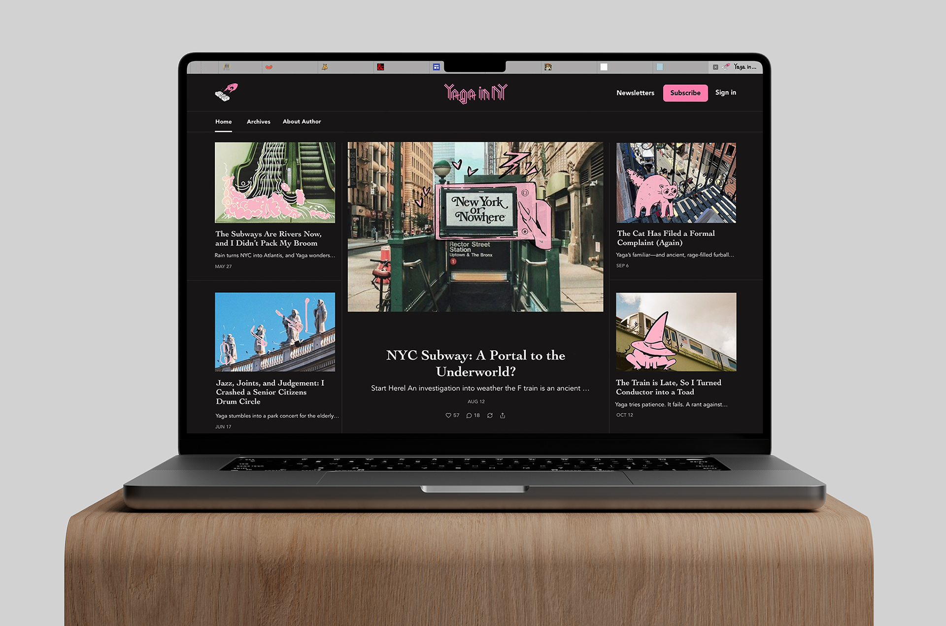
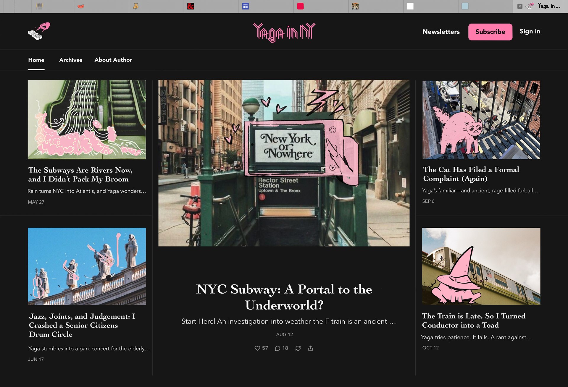
Solution
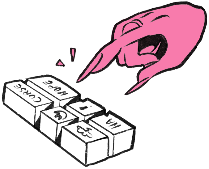
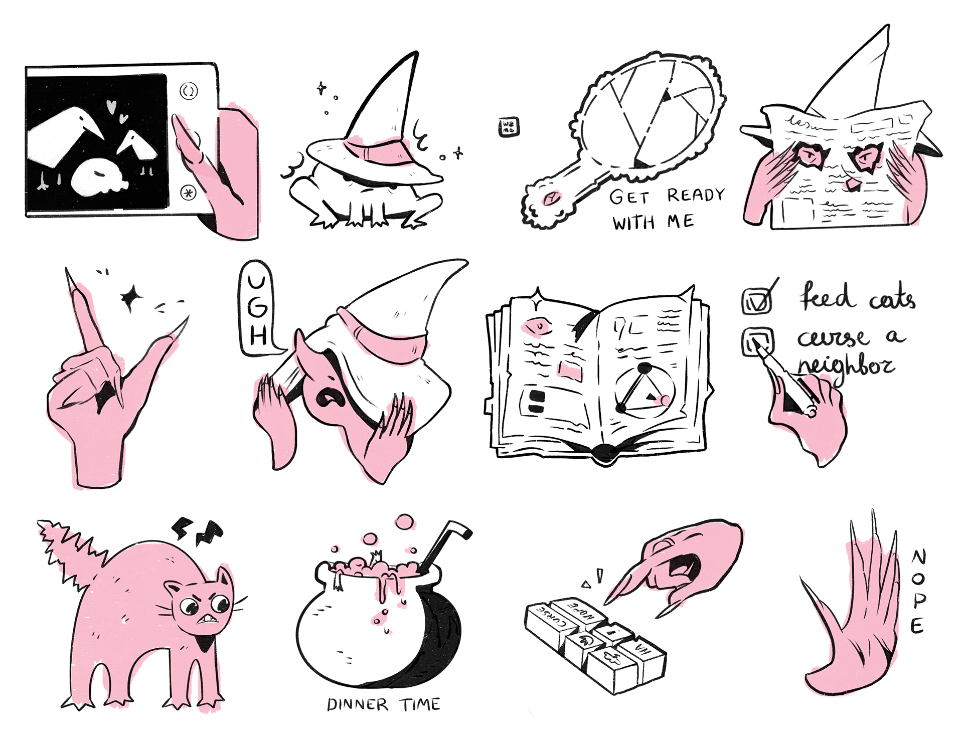
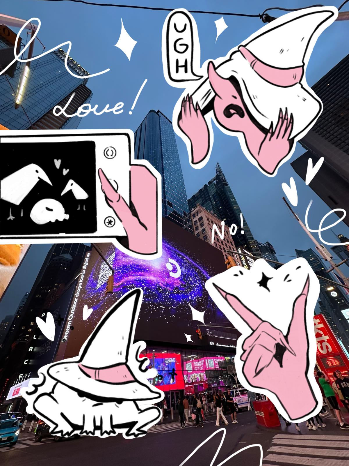
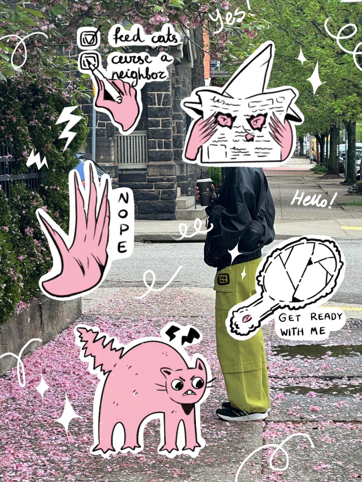
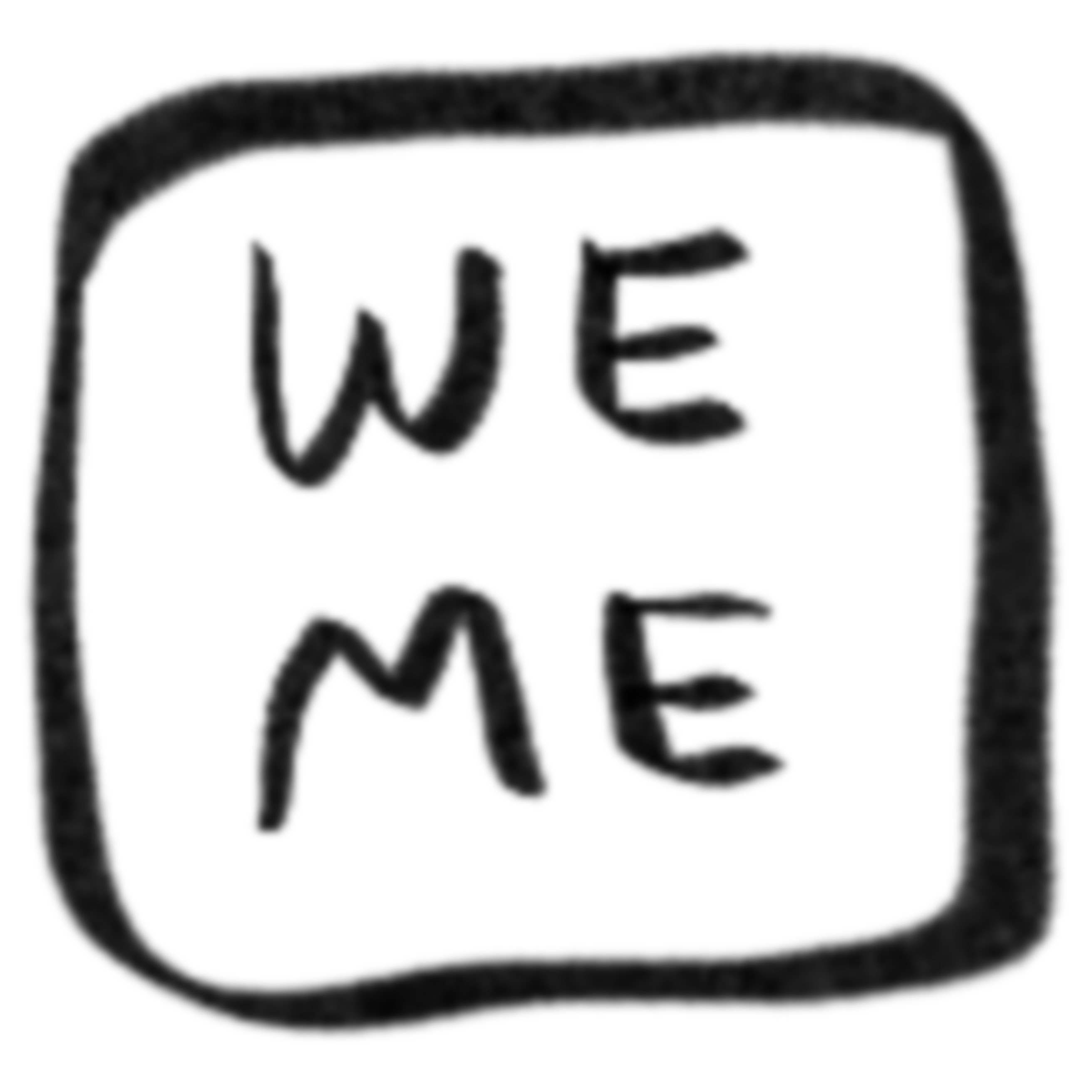
I designed a clean, structured page that emphasized typography and hierarchy for easy reading. In addition, I extended the system with stickers/icons, which gave the client low-effort ways to customize future posts without technical edits.
Impact
→ The redesign gave the client a simple, low-maintenance system for publishing, reducing barriers to consistent posting.
→ The clean typography and clear hierarchy create a more engaging reading experience, supporting longer time-on-page and return visits.
→ By extending the system with stickers/icons, the client can easily customize posts, strengthening the blog’s identity and making it more memorable for readers.